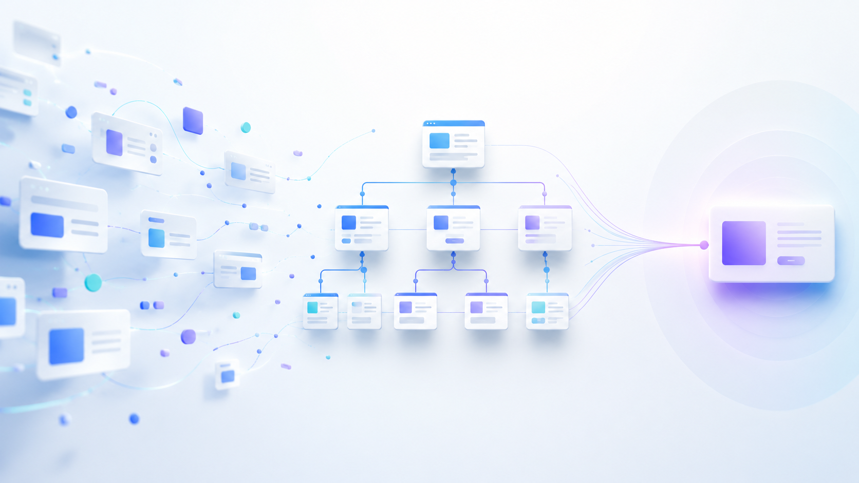
Website Structure Can Make or Break the User Experience
A website can look modern, load quickly, and still perform poorly if visitors cannot find what they need.
Users usually arrive with a clear purpose.
They may want to:
- understand a service
- compare options
- view previous work
- check pricing
- contact the business
- request a quotation
- make a purchase
If the website structure makes these actions difficult, visitors may leave before taking the next step.
This is where website information architecture becomes important.
1. What Is Website Information Architecture?
Website information architecture is the way pages, content, categories, and navigation are organized across a website.
It includes:
- main navigation
- page hierarchy
- categories
- subcategories
- internal links
- URL structure
- breadcrumbs
- search
- calls to action
A good structure helps users understand where they are and where they should go next.
Good information architecture reduces confusion and makes the website easier to use.
2. Too Many Menu Items Create Confusion
A navigation menu should help visitors make decisions quickly.
Adding every possible page to the main menu can create unnecessary complexity.
Instead, important pages should receive priority.
Supporting pages can be organized under broader sections such as:
- Services
- Solutions
- Industries
- Resources
- About
- Contact
The goal is not to show everything at once.
The goal is to make important information easy to discover.
3. Important Pages Should Be Easy to Reach
Your most valuable pages should not be hidden several levels deep.
These may include:
- core service pages
- product pages
- pricing
- case studies
- contact pages
- quotation forms
- booking pages
If visitors need several clicks just to reach an important page, the structure may be too complicated.
A simple hierarchy improves both usability and conversion potential.
4. Clear Navigation Labels Improve UX
Creative labels can sometimes make navigation harder to understand.
For example, instead of:
- Explore
- Discover
- Connect
- Our Impact
clearer labels may be:
- Services
- Portfolio
- Contact
- Case Studies
Visitors should immediately understand what a navigation item means.
Your website can still be creative without sacrificing clarity.
5. Website Structure Should Follow User Intent
Businesses often organize websites around internal departments.
Customers usually think differently.
An agency may internally use departments such as:
- Creative
- Technology
- Performance
- Strategy
But customers may be searching for:
- Website Development
- SEO
- Branding
- Meta Ads
- eCommerce Development
Your website should be organized around how customers search and make decisions.
6. Good Architecture Supports Better Conversions
Visitors rarely convert immediately after landing on a website.
They normally move through several pages before making a decision.
A typical journey may look like:
Homepage → Service Page → Case Study → Contact
Another may look like:
Blog Post → Service Page → Pricing → Request a Quote
Each page should naturally guide visitors toward the next relevant step.
Useful conversion paths may include:
- service to case study
- case study to contact
- blog post to related service
- product page to checkout
- pricing page to consultation
- landing page to enquiry form
Every important page should make the next step obvious.
7. Website Architecture Also Supports SEO
Search engines need to understand how pages relate to each other.
A logical structure makes these relationships clearer.
For example:
/services/
/services/web-development/
/services/web-development/wordpress/
/services/web-development/ecommerce/
This structure clearly shows how the pages are connected.
A random collection of unrelated URLs is harder to understand.
Good architecture can also support:
- crawling
- indexing
- internal linking
- topic relationships
- page authority distribution
- user navigation
SEO and user experience often benefit from the same structural improvements.
8. Internal Linking Should Be Intentional
Internal links connect related pages across the website.
They can help users discover:
- related services
- supporting articles
- case studies
- products
- guides
- FAQs
Internal linking should feel natural.
Do not add links simply for SEO.
Link pages when the connection genuinely helps the visitor.
Strong internal linking creates a clearer path through the website while helping search engines understand which pages are important.
9. Avoid Creating Multiple Pages for the Same Purpose
Creating many similar pages can make the website harder to manage.
For example:
- SEO Services
- Professional SEO
- SEO Solutions
- SEO Marketing
- Search Engine Optimization Services
If these pages all target the same audience and offer the same service, they may create unnecessary overlap.
Each page should have a clear reason to exist.
Before creating a new page, ask:
- does it serve a different search intent?
- does it target a different service?
- does it answer a different customer question?
- does it provide unique value?
If not, improving an existing page may be better.
10. Mobile Navigation Needs Extra Attention
A navigation system that works well on desktop may feel complicated on mobile.
Common problems include:
- too many menu levels
- long dropdowns
- small tap areas
- hidden contact options
- important pages buried in submenus
Mobile users should be able to reach key pages quickly.
Review the mobile menu and ask:
- Are the most important pages visible?
- Are menu labels clear?
- Are submenus necessary?
- Is the contact option easy to find?
- Does navigation require too many taps?
Mobile structure should be simple and intentional.
11. Breadcrumbs Help Users Understand Location
Breadcrumbs are useful when a website has deeper levels of content.
For example:
Home → Services → SEO & Analytics → Technical SEO
They help visitors understand:
- where they are
- which category they are inside
- how to move back to a broader section
Breadcrumbs are particularly useful for:
- eCommerce stores
- large service websites
- knowledge bases
- SaaS documentation
- content-heavy websites
They provide another navigation path without replacing the main menu.
12. Website Search Should Support Navigation
Large websites may benefit from internal search.
This is especially useful for:
- eCommerce stores
- large blogs
- documentation sites
- knowledge bases
- resource libraries
- websites with many products or services
Search should make discovery easier.
However, it should not be used to hide poor navigation.
Visitors should not need to search for basic information such as your primary services, pricing, or contact page.
13. Review the Structure as the Website Grows
Website architecture can become messy over time.
Businesses regularly add:
- new services
- new products
- landing pages
- blog posts
- campaigns
- resources
- location pages
Without regular review, the website can slowly become difficult to navigate.
A simple architecture audit can identify problems before they become serious.
Review:
- main navigation
- page hierarchy
- duplicate pages
- internal links
- mobile navigation
- important conversion pages
- URL structure
- outdated content
Your website structure should evolve with the business.
14. Start With a Simple Website Architecture Audit
You do not need to redesign everything immediately.
Start by asking:
- Can a first-time visitor understand what we offer?
- Are our most important pages easy to find?
- Are related pages grouped together?
- Are navigation labels clear?
- Are there duplicate or overlapping pages?
- Do important pages receive enough internal links?
- Is the URL structure logical?
- Is mobile navigation simple?
- Does every important page have a clear next step?
If several answers are no, restructuring the website may produce more value than another visual redesign.
Better Structure Creates Better Digital Experiences
A successful website needs more than attractive design.
It also needs a clear structure that helps visitors move naturally from one page to another.
Good information architecture connects:
- user experience
- navigation
- SEO
- content
- conversion strategy
The goal is not to create more pages.
The goal is to make existing information easier to understand, easier to find, and easier to act on.
A website that guides visitors clearly is more likely to turn attention into meaningful business results.